6011.7 – a new novel

Josh_Mowll_Lifeboat

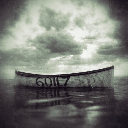
I’ve recently written a novel solely aimed at adults called 6011.7. This is exciting new territory for me, and award-winning publisher Unbound have taken on. The idea is to crowdfund the book initially, which has advantages and disadvantages. I intend to write a post focusing on this approach to publishing very soon.

The novel is about love, hate and Dada. Quite a trio. This is unlike anything I’ve written previously, so please don’t back or buy this if you are expecting something along the lines of my other books; 6011.7 most definitely contains strong language and adult themes.

From the beginning I wanted 6011.7 to have a distinctive look and feel; I’ve always enjoyed epistolary novels because they have a directness, intimacy and tension all of their own, so I quickly settled on this as a style. I really enjoy wrapping novels in ephemera and photographs to bring them to life, and to blur the boundaries between fact and fiction; with 6011.7 this will require quite a bit of work when it comes to artworking every page (yes, every gorgeous page, as each will be unique down to the smudges and mottling… and you can never have enough mottling in my opinion). I want readers to know they are buying something markedly different from all of the other lovely books shouting: ’Buy me. No BUY ME! No, no, BUY ME!’.

The story’s narrative revolves around an expedition to hunt for mythical sea creatures in 1921. In the planning stages, the monsters had been very much plot motive, not character motive. I hasten to add my novel isn’t anything like a Ridley Scott film. When I started to write, the characters’ personal monsters expanded into very fruitful territory: how their hidden daemons had influenced their lives and relationships. This was, for the most part, more interesting than writing chase scenes with big Kraken-sized beasts… although you can’t have a monster hunt without monsters, so I needed to find a way to accommodate and satisfy this aspect of the book.

I’ve always loved Dada, and had included it as a theme in a small way from the first draft. This was one of the most enjoyable parts of finding the book’s drive and direction. I have often worried that Dada lurks in Surrealism’s shadow, and yet to my mind it was far more dynamic and innovative; I could see a very attractive connection between Dada and the absurd challenge of hunting for mythical sea monsters.

The irrational qualities of Dada chimed with the script more and more as the story developed. I’ve found love and relationships can be at times absurd, rude, funny, and irrational, so these parallels were fascinating to work with. Dadaism grew in the book like ivy, and overtook all aspects of the story, giving it a direction, a very distinctive look and an overarching theme. It’s an illusive artistic movement at the best of times, and yet it was a surprisingly firm structure on which to build a novel.

I hope will be a very unusual and beautifully packaged book if I managed to raise enough interest through crowdfunding. There are no guarantees I will make the target: if I don’t the book won’t happen. If you are interested, you can find out more at the link below, where there is also a video of me discussing the book:
https://unbound.com/books/6011-7

Beautiful Titan – Free To Download 25th-26th September (Amazon Kindle only)

CaptionCard_FreeGiveaway_small

It’s true! You can download Beautiful Titan by Joshua Mowll FREE today (Amazon Kindle only).


Click HERE for the link to Amazon

Beautiful Titan is an alternative history novel for YA+ (full details below).

This promotion runs for two days from 25th to 26th September (from approx. midnight PST/08.00hrs GMT)

Watch the trailer here:

ABOUT THE BOOK:

851AD – Six hundred years after the Roman Industrial Revolution…

The world of Beautiful Titan is familiar yet strange: an alternative history where Roman planes fly and outlawed ancient Egyptian religions secretly thrive. This is a story about love and doubt, trust and betrayal, of allegiances and friendships, and ultimately an impossible choice … the kind of choice that no one should ever have to make.

When Anuk, 19, daughter of a circus owner, meets the mysterious Felix, a gem smuggler on the run, it is the start of a strange romance controlled by forces far more powerful than themselves. Along with Anuk’s brother Quin, the trio are rounded up and taken prisoner by the secret police, and they start a dangerous journey into the dark heart of an industrialised Roman Empire.

Falsely enslaved for crimes against the King of Rome, the three find themselves assigned to the depleted 190th Legion. This besieged unit is embroiled in a war of independence which rages in the breakaway western province of Octo (North America) during a bitter and icy winter. With this perilous backdrop, Anuk and Felix’s complex friendship is forged, not through trust, but the need to survive.

But it isn’t in Octo that Anuk will find the answers to who and what Felix is, or discover the truth about her and Quin’s own curious life with the circus. Anuk can only discover these answers in Rome itself: here – and in mortal danger – she comes face to face with the grim tyrant King Belisarius himself.

Sometimes in war, love is the greatest enemy.


Beautiful Titan – my new novel

CaptionCard_Amazon3

First of all, this novel is long overdue. I’m sorry. You should try being an author! It’s a slow and tricky business.

Perhaps I’m being a bit harsh on myself. My first novel Operation Red Jericho was published almost exactly ten years ago, so five novels in ten years is not too shameful.

I’m really proud of Beautiful Titan. I had the idea about five years ago, and the story has been through several incarnations since. I hope that if you download it, you’ll enjoy it as much as my other books. I have set up a standalone website where I talk about the story, and you can get the link to Amazon, or click on the image above. There is even a trailer, handcrafted by me, with CGI action sequences no less:

http://beautifultitan.com/

BACKGROUND TO THE NOVEL:

I did a majority of the writing in Switzerland over the winter of 2012-13, and it took about 6 months to complete. At the time, my wife and I were living in an apartment up a very steep hill (as you’d expect), in a village with a name like a Star Trek baddie (Klingnau). I have to say that not a huge amount happens in Klingnau apart from a very good wine festival in October, so it has very few distractions.

We weren’t near the mountains but on clear days in the spring and autumn we could see the Alps from our balcony. Alas, most of the time we couldn’t see the Alps. In fact, most of the time the most distracting landmark was the cooling tower of a nuclear power plant the Swiss have built as close to the German border as they could possibly get it!

(Here are some pics of Klingnau to set the scene)


This slideshow requires JavaScript.


As with all freshly written books, you don’t know if they are any good. I appointed a very good editor, and his input sharpened the detail, but he agreed the plot was essentially there and functioning well. It was quite a departure in style from my earlier novels, so for the first time I sent the manuscript out to a wide selection of friends to be read and critiqued. I’ve never done this before. It was an anxious moment. However, the reaction was extremely encouraging so I thought it was worth publishing.

The book is for a slightly older age group than my previous books, and is for a YA 16+ readership.

Let me know what you think.

Joshua Mowll

http://beautifultitan.com/

Does your self-pub front cover look like a dog’s dinner, even though you paid for it? 12 possible reasons why.

CheapCover

You can tell the quality of a graphic designer by the fonts they use

The first question you’re probably asking is, as an author, what qualifies me to talk about front covers? What do I know? My answer is that I have a degree in graphic design and have been working in the business for 20 years.

An immediate caveat: I’m not looking for cover design work. This is not a pitch. I can do them, but as you can see from my portfolio: http://joshuamowll.net/ it’s not necessarily my thing. I do, however, have a professional opinion on them and I’ve seen some absolute shockers recently, hence the post.

OK, so here’s the problem: you’ve paid good money to have a book cover designed because you’ve heard that it’s a ‘must have’ when launching your eBook on Amazon, etc… But the cover isn’t working for you, no matter how many times you look at it. It simply doesn’t grab you, and somehow it doesn’t look as good as traditionally published front covers. So what’s the problem?

Here’s my checklist of what might have gone wrong (assuming you have paid a graphic designer to create the cover):

1. Ask yourself this: Has your designer simply downloaded a free font, slapped on a free stock image, tried out a few Photoshop filters on it, then finished it off with a massive lens flare?

Has your designer put any thought into it, or are they knocking out four or five similar covers a day? Does your cover look similar to thousands of others? Did you choose the right designer?

2. Has your designer or illustrator actually read your book?

If not, how exactly are they having any meaningful artistic ideas about your cover? Are they solely using your notes and direction for what you envision for the cover?

3. You are probably not a designer, so why are you giving out design tips?

If I was having keyhole surgery done on my knee I wouldn’t be offering my opinion to the surgeon, or making suggestions on how he could do his job better. I’d trust that he was a skilled expert with many years of experience and training under his belt and let him get on with it. Research lots of cover designers, find one you like, then let them do their job.

4. This sounds harsh, but I’m going to say it: Are you the real problem in the design process?

Have you interfered with the layout at every stage and gone against the ideas and suggestions of the designer you employed? Is that why the end result looks compromised?

Giving direction and notes on how you think the cover should look makes the designer’s life easier because they don’t have to read your 700-page epic, but in an ideal world the designer should be giving you ideas, not vice-versa.

5. You probably won’t get a good result out of a cheap online cover design company offering a quick delivery service.

You guessed it – the end result will most likely look cheap and quick. You pay for what you get.

6. Never use friends or family to create an illustration, or design a cover, unless they are a working illustrator or designer with a broad client base.

You might well think it would be a lovely idea if, say, your amateur artist cousin created you a lovely cover. Why risk it after all that hard work you’ve put in to create the novel? There are literally hundreds of thousands of excellent illustrators and designers out there, all quite reasonably priced, who will do a better job.

7. Colour/color palette

No lurid colours. The downfall of many covers are vicious, ill-considered palette. The smartest covers often have very limited palettes. Search color/colour theory online.

8. Less is more. In all things.

Do you have a large amount of clashing elements or ideas on your cover, or have you insisted on your name being ridiculously big?

9. Fonts:

There are surprisingly few good fonts; conversely, there are many, many thousands of dreadful ones. If you don’t know the difference, or can’t tell the difference, find a designer who can.

You can tell the quality of a graphic designer by the fonts they use. Make sure they choose typefaces from proper font foundries. These will cost more, but it is minor details like these that make all the difference. The temptation is to use a free face to cut down the costs. It’s free for a reason.

10. Fonts you should probably avoid having on your front cover:

  • Brush Script
  • Times New Roman
  • Papyrus
  • Arial
  • Comic Sans
  • Copperplate
  • Generic grunge fonts
  • Helvetica
  • Courier

 If you’re wondering why these fonts are not good choices, I urge you to reread point 3 above.

11. Typography:

Stretched type: No type should be stretched (horizontal or vertical scaled) in any direction. Ever. It is simply bad design. Fonts are beautiful things and should be treated with respect.

All fonts should be properly kerned; never trust a computer to do kerning, especially on something like a book title. If this is the first time you’ve heard about the dark art of kerning, then…

http://help.adobe.com/en_US/indesign/cs/using/WSa285fff53dea4f8617383751001ea8cb3f-6e14a.html

12. A good designer will cost you money, but the cover is your novel’s shopfront.

At the point of making a sale, the cover is clearly one of the key ingredients in your potential reader’s decision making process. If you believe in your story, have invested time and energy in creating a book, why skimp? The cover is the first point of contact with your reader. Don’t let a good book be ruined by a bad cover.


First novel, first chapter, first doubts: 10 strategies for starting your story.

Image

If 2014 is the year you decided to write a novel and you’re already stuck on chapter one, here are my top ten ways to help you over the first hurdle:

1. Don’t start with chapter one, start by doing lots of planning. This might not feel like writing a book, but it is. This way you’ll know exactly what it is you’re trying to achieve in chapter one, rather than driving blindly into a snowstorm hoping to reach a destination. Writing the first chapter is a lot easier if you know what happens in the final chapters of your book.

2. For a first time novelist, it is easy to be put off by what you initially produce. In your imagination you had expected to see award-winning prose flowing from you as if a vast and untapped literary dam had just been breached. Maybe your first page is not that good. The self-doubt sets in. This is not a book you would buy, so why continue? Rest easy. It will feel very strange to see your first novel emerging on the page. Be encouraged that you are actually sitting down to write. The polishing can come in later drafts.

3. Writing your first novel is like being given a very powerful and complex motor vehicle to drive. The only way to learn to write is to write. Lots. Very much like driving, it will get better and it will get easier with experience. Don’t expect too much at first. It is more important to be making forward progress than editing and re-editing four sides of A4 until you get bored and decide writing probably isn’t for you. Keep draft one progressing at steady rate. Learn by making some mistakes.

4. A first draft is not a novel, it’s a testbed for ideas. Chapter one will go through several later drafts, so don’t put too much pressure on yourself.

5. In the later stages of the editing process, I’ve found chapter one often needs to be heavily rewritten to accommodate new themes, characters, plot lines and creative directions discovered during the first draft writing process. Don’t give up because you loathe your first  attempts at crafting the first chapter. You could be abandoning a perfectly viable story for no good reason.

6. First night nerves: If you are really having problems opening your book, why not start at chapter two and then going back to write chapter one towards the end of the first draft process. If you have done enough planning (see point 1 above) then you will know where the story should be by chapter two. Go from there and see what happens.

7. Don’t overload chapter one with exposition (history lessons and info dumps). Get on with the story. Engage the reader. Make something happen to your main character which will fundamentally alter their life. We don’t need to know where they grew up, or the history and political machinations of the 14th Orc War. We are more interested that your main character has just discovered they were adopted at birth, or that they’ve suddenly lost the ability to read people’s minds. You are sending your character on a journey. Chapter one is the jumping off point rather than a place to laboriously explain the world in which they live.

8.  If you are going to tell some extremely tall tale, such as your narrator does indeed have the ability to read minds, get this extraordinary character trait out in chapter one. The later you leave it, the less believable it will become. Your reader can relax, accept this as a reality within your story, and then not worry about it because it’s clearly going to be a fundamental building block for the rest of the book.

9. You have about 60 pages to captivate a reader. Spend them very wisely.

10. If you are still not making progress, then go back and do more planning. Chapter one should be a hurdle, not an impenetrable barrier. Work out what story you are trying to tell rather than working out how to write a good opening chapter: the story is more important and should control chapter one, not vice-versa.

10 thoughts on the tricky task of naming a novel

Title

Yacht names. There are some terrible ones painted on the sterns of some very pretty boats.

There’s clearly no formula for creating a novel’s title, and this post is more about the thought processes I’ve gone through recently, offered up as an idle distraction to anyone doodling on the front page of their own manuscript.

If your doodling isn’t working, I don’t recommend this random book title generator website, although it will divert and work as a splendid displacement activity for ten minutes or so, until you realize it’s really no help at all, fun though it is:

http://www.kitt.net/php/title.php

Here are some thoughts on the difficult task of naming a book:

1) Simmering down a mighty 300 page novel to five memorable words or less is not a task to be taken lightly. Clean your office windows and prepare to stare out of them like Holmes on an awkward case. Consider buying a violin (or guitar, see point No.5 below) and employ a Mrs. Hudson to bring you regular cups of tea as you ponder.

2) Still nothing? Perhaps create a list of candidates by reviewing key scenes in the book. The obvious danger here are you’ll spot a few typos, and some minor, yet rampant, structural imperfection in the plot. You switch to editing again to rectify the faults, and delay the naming ceremony for at least another month.

3) Back to the candidate list. Nothing is jumping out at you. Situation normal.

4) Bored — the title still being just out of reach — you’re back to wasting time meddling with the digital oracle that is the random title generator: The Trembling History, Missing Doors, The Voyages’s Voyage. All great album names, but they have nothing to do with your script, not a single thing. You sit down with paper and pen (!) and vow never to use the internet again until the title is decided upon.

5) The afternoon you set aside to finally solve the problem takes a musical lurch off course: Curiously, you find yourself learning Lynyrd Skynyrd’s Free Bird on the guitar by watching a variety of ‘How To’ tutorials on YouTube. None of the hairy guitar gurus strictly agree, but after an afternoon’s careful study, you have the ten minute solo committed to memory and your finger tips are now bleeding.

6) You know the title will be a flag to rally to, or a disaster signal if readers hate your book. Either way, you’re going to be stuck with it. These thoughts generate ever more spiralling levels of procrastination.

7) You fret. Is the title is over complicated? Are future readers going to remember it easily if told about it in a noisy café? Oh, the worry of it all.

8) You can’t decide. You abandon all hope and consider the best thing is to burden your friends and family with this seemingly unsolvable problem. You post your shortlist on Facebook. Brilliant. But the issue here is many of your friends and family haven’t read the book. The titles they like are the ones you have already crossed out but reinstated on the list at the last moment to pad out the title you’re beginning to feel comfortable with.

9) The candidate list is back. Again. Shorter now. The truth is, no one can help you with this, the final decision. It’s your problem. No matter what tortuous path you take to choosing a title, the ultimate question has to be: Does this title grab like a grappling hook? Genuinely? Would I pick up this novel if I saw it on a shelf in a bookshop?

Captain’s log, supplemental:

10) My particular book titling hate at the moment is for ones referencing some heavenly object in the night sky ‘rising’. Don’t get me started!

Writers: Worried about your characters’ names?

I recently read a draft manuscript for a friend and I was immediately struck by the extremely weak leading character’s name. It bugged me like grit in my shoe from start to finish. It seemed a basic thing to try to get right, but also quite an easy problem to fix. Of all the various chores (easy and hard) a writer has to undertake to create a novel, I would rate character name creation as one of the most fun. Fun, but vitally important. I tend to collect names I think could be useful in the future for just this purpose.

I’ve just finished the latest draft of my new novel, and the first task for the (hopefully) final draft will be to reassess all the names I’ve been using. I know at least one of the main characters now has a name that isn’t quite working, and will be one of the first things on my ‘Find and Replace’ list.

For a masterclass in names the first port of call is always Dickens. I couldn’t write a post on this subject and not mention the master: Dickens. Dickens, and thrice, Dickens. Splendid. Let’s move on.

I happened to be reading the shooting script for the screenplay ‘The Usual Suspects’ concurrently with my friend’s draft, and the contrast with the naming issue was like sugar and lemons. It’s worth taking a look at Christopher McQuarrie’s excellent 1995 screenplay if you get a chance.

What a pantheon of inspired monikers McQuarrie summons up for us: McManus, Keaton, Fenster, Hockney, ‘Verbal’ Kint, Kobayashi and, of course, the criminal mastermind behind the plot: the brilliantly named Keyser Söze (pronounced ‘so-say’ if you’re not familiar with the work).

To my mind they don’t sound much like a bunch of steam engine enthusiasts out for the afternoon photographing locomotives; with a set of players of this strength, McQuarrie begins his storytelling process with an incredibly strong hand.

I’d doff my writer’s fez at Mr McQuarrie if:

1) I knew what the chap looked like.

2) I just happened to be walking about Hollywood in a fez.

So then… I just need to find up a better name. Er… where did I put that bit of paper?

Amsterdam


I’m now living in Amsterdam in the Netherlands where my wife has a new job.

I woke this morning up to find an enormous crane outside my office window.  I don’t think the pictures do it justice, although I’ve montaged them together to show the size of the thing. It looks like they are building some sort of roof terrace on top of the house opposite.

The best thing about my new office is that it has a hoist. The building was once a warehouse, so this was used to haul up goods. It looks like some sort of medieval torture device!

JM

The Great Space Race website goes live

The Great Space Race website is up and running. It’s got as much stuff as I could possibly cram onto it. There’s a PDF of the first two chapters, music, wallpapers, movies, links… you can see it if you click HERE

This is the very last creative task associated with Space Race, which has turned out to be quite an intriguing journey all-in-all. I’ve certainly had to learn some new skills – I’ve recorded an album, designed and constructed a robot monkey, built a nine foot tall rocket (with help from my Dad), shot a music video and edited it, and all in the name of literature!

The website has been a great way to pull all of these different strands together, but more than anything, I hope the online content helps to make the book as fascinating as possible… and fun, too. My fave is Barry the robot’s music video.

Here’s a very short film of me recording the music, just to give a taste of what I’ve been doing!

Countdown to the launch of The Great Space Race

The launch of my next novel, The Great Space Race is under a week away now, and very nearly everything is in place.

The new website should go live in a couple of days, which is very exciting! I’ve tried to make it look as much like the book as possible. I’ll post a message here once it goes live.

Steve Friendship and his editor Jade of Large Scale Films have been busy editing together the 5 short web documentaries (AKA the webisodes) about me, my work and some background on The Great Space Race. These are up and running and are definitely worth a look CLICK HERE. I recommend webisode 5 for any fans of the illustration in the Guild Trilogy

I’ve also written and recorded a music album to go with the The Great Space Race, and have therefore had to learn the dark arts of sound engineering through a process of hit and miss. It’s been lots of  fun and I hope it will help build the background ‘world’ of Ace, the narrator in the book (he plays in a band). I’ve set up a MySpace page for the band, and uploaded 4 tracks. You can hear them HERE

Today, I have the last piece of work to finish off – a music video to go with one of the music tracks. This features the robot monkey called Barry, the hero of the story. I’ve recorded it, so now I just need to edit it. Here’s a pic from the video shoot I recorded last week: